
Responsive Web Design Company
Responsive Web Design Company: Building Sites That Work on Every Device
Let me ask you something: when was the last time you pulled out your laptop to quickly check a website? Probably never, right? You grabbed your phone.
That’s exactly what your customers do. Over 60% of web traffic comes from mobile devices. For some industries, it’s 70-80%. Yet I still see businesses with websites that look great on desktop but are absolutely terrible on phones—tiny text, buttons too small to tap, horizontal scrolling, menus that don’t work, forms that are impossible to fill out.
Every single person who tries to use your site on their phone and gets frustrated? That’s money walking away. They’re not going to switch to their laptop later to give you another chance. They’re moving on to your competitor whose site actually works on mobile.
Here’s what most people get wrong about responsive design: it’s not just about making desktop layouts shrink to fit smaller screens. That’s how you end up with technically responsive sites that still suck on mobile. Real responsive design means rethinking the entire experience for each device—what information people need, how they interact differently on phones versus tablets versus desktops, and designing specifically for those contexts.
I’ve built responsive websites for years, and I’ve seen the pattern clearly: businesses that prioritize mobile experience see better engagement, higher conversion rates, and lower bounce rates. Not because mobile users are different people—because the same people have better experiences.
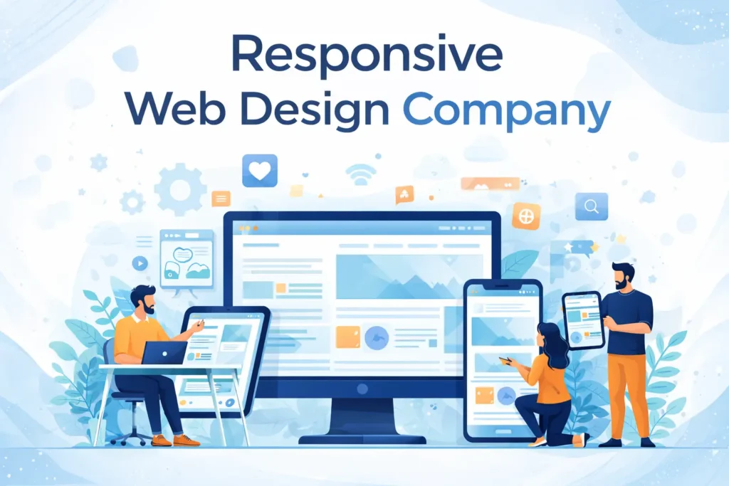
Let me show you what responsive web design actually looks like when it’s done right.
What Is Responsive Web Design?
Responsive web design is creating websites that automatically adapt their layout, content, and functionality to work beautifully on any screen size—from phones to tablets to desktops to everything in between.
But here’s what it actually means beyond the technical definition: responsive design is about meeting users where they are. It’s designing fluid layouts that reflow based on screen width, images that scale appropriately without breaking, navigation that works on touch screens and with mouse clicks, text that’s readable without zooming, buttons large enough to tap with fingers, forms optimized for mobile keyboards, and experiences tailored to how people actually use different devices.
The old approach was building three separate websites—desktop, mobile, and tablet. That was expensive, hard to maintain, and always led to inconsistent experiences. Responsive design solves this with one website that adapts intelligently.
But responsive design done properly isn’t just technical—it’s strategic. It’s understanding that someone on their phone at a bus stop has different needs than someone at their desk. It’s recognizing that mobile users are often looking for specific information quickly—contact info, hours, directions, key product details—while desktop users might be doing deeper research or complex tasks.
The best responsive sites don’t just resize—they prioritize, reorganize, and optimize for each context while maintaining brand consistency and functional completeness across all devices.
Why Responsive Design Isn’t Optional Anymore
You might think “my site works on mobile, it’s just small.” That’s not good enough. Here’s why responsive design is business-critical:
Mobile is the majority: Over 60% of web traffic is mobile. For many industries—restaurants, local services, retail—it’s even higher. If your site doesn’t work well on phones, you’re failing the majority of your visitors.
Google prioritizes mobile: Google’s search index is mobile-first. That means they evaluate your mobile site to determine search rankings, even for desktop searches. Bad mobile experience hurts your SEO everywhere.
Conversion rates depend on mobile experience: Mobile users convert just as much as desktop users—if the experience is good. Bad mobile experiences kill conversions, no matter how good your products or services are.
Bounce rates skyrocket on bad mobile sites: If your site is hard to use on mobile, people leave in seconds. High bounce rates signal to Google that your site isn’t valuable, hurting your rankings further.
Professional credibility is on the line: An outdated, non-responsive site makes your entire business look unprofessional. People judge your company’s quality based on your website’s quality.
One site to maintain is way easier: Separate mobile and desktop sites mean double the work, double the costs, and inevitable inconsistencies. Responsive sites are maintained once and work everywhere.
Future-proofing for new devices: New screen sizes launch constantly—foldable phones, various tablets, ultra-wide monitors. Responsive design adapts automatically without rebuilding.
Accessibility improves: Many responsive design principles overlap with accessibility—scalable text, clear navigation, touch-friendly targets. Better mobile experiences often mean better accessible experiences.
Local search performance: Mobile users searching for local businesses (“pizza near me”) need quick, easy mobile experiences. Bad mobile sites lose local business to competitors.
Social media traffic is mobile: When people click links from Facebook, Instagram, Twitter, TikTok—they’re on phones. If your site doesn’t work well, that entire traffic source is wasted.
Speed matters more on mobile: Mobile networks are slower than WiFi. Responsive sites optimized for mobile performance load faster, keeping users engaged instead of waiting and leaving.
The question isn’t “should we have responsive design?” It’s “how fast can we fix our non-responsive site before we lose more money?”
What Real Responsive Design Looks Like
Responsive design isn’t just “make it fit smaller screens.” Here’s what it actually involves:
Mobile-first design approach: We design the mobile experience first, ensuring core functionality and content work perfectly on small screens, then enhance for larger screens. Not the other way around.
Fluid, flexible layouts: Layouts that flow and adapt smoothly across all screen sizes. Not fixed-width designs that break at certain sizes, but truly flexible systems that work at any width.
Optimized images and media: Images that load appropriately for device size and resolution. Small, fast images for phones. Higher resolution for desktops. Video that works without killing mobile data plans.
Touch-friendly navigation: Menus that work with fingers, not just mouse cursors. Hamburger menus on mobile that expand to full navigation on desktop. Touch targets large enough to tap without frustration.
Readable typography: Text that’s comfortable to read without zooming. Appropriate line lengths, font sizes that scale, and hierarchy that works on small screens.
Strategic content prioritization: What’s most important on mobile might differ from desktop. Phone numbers and directions prominently placed on mobile. Detailed information more accessible on desktop.
Simplified forms: Mobile-optimized forms with appropriate keyboard types (numeric for phone numbers, email keyboard for email addresses), minimal required fields, and large, easy-to-tap submit buttons.
Performance optimization: Fast loading on mobile networks. Optimized code, compressed images, minimal requests, and strategies to show content quickly even on slower connections.
Breakpoint strategy: Thoughtful decisions about when layouts change. Not just “mobile, tablet, desktop” but considering the full spectrum of screen sizes and optimizing transitions.
Gesture support: Swipe, pinch, zoom—using touch gestures naturally where appropriate while not requiring them for critical functions.
Orientation flexibility: Working in both portrait and landscape orientations. Many people watch videos or view content horizontally—sites should adapt.
Context-aware features: Click-to-call phone numbers on mobile. Map integrations that open in navigation apps. Features that leverage mobile capabilities.
Consistent brand experience: Looking and feeling like the same brand across devices while optimizing for each device’s strengths and constraints.
Thorough testing: Actually testing on real devices, not just browser resize tools. Testing on older phones with smaller screens and slower processors, not just the latest iPhone.
Real responsive design is comprehensive—touching every aspect of design, development, content, and user experience.
Our Responsive Design Approach
Here’s how we actually build responsive websites:
Mobile-first design philosophy: We start with mobile. This forces us to prioritize what’s truly important and essential. Once mobile works perfectly, we enhance for larger screens by adding features and information that make sense in those contexts.
Device and user research: We analyze your analytics to understand what devices your users actually use. iPhone 12? Android phones? Tablets? Old devices? We design and test for your real audience, not theoretical users.
Content strategy for multiple contexts: We work with you to identify what information is critical on mobile versus desktop. Someone on a phone looking for your restaurant needs hours and directions immediately. Someone on desktop might want your full menu and story.
Progressive enhancement: We build core functionality that works everywhere, then add enhancements for devices that support them. Nobody gets a broken experience, but capable devices get richer experiences.
Flexible grid systems: We use CSS grid and flexbox to create truly flexible layouts. Not rigid, fixed-width designs that just shrink, but fluid systems that reflow content intelligently.
Responsive images and media: We implement responsive images that load appropriately for device size. Small images for small screens, high-res for retina displays, lazy loading for performance, and video that adapts to bandwidth.
Touch-optimized interactions: We design for fingers, not just mouse cursors. 44×44 pixel minimum touch targets, spacing between interactive elements, swipe gestures where appropriate, and no hover-dependent functionality.
Performance-first development: We optimize aggressively for mobile performance. Minimal JavaScript, compressed assets, efficient CSS, critical CSS inline, and strategies to show content fast even on slow connections.
Cross-device testing: We test on real devices—multiple iPhones, various Android phones, iPads, Android tablets, different browsers. Not just Chrome’s device simulator, but actual hardware experiencing real network conditions.
Accessibility throughout: Responsive design and accessibility overlap significantly. Scalable text, clear focus indicators, keyboard navigation, screen reader compatibility—all built in from the start.
Analytics implementation: We set up tracking to monitor performance across devices. Where do mobile users struggle? What’s the mobile conversion rate versus desktop? Data guides continuous improvement.
Iterative refinement: Responsive design isn’t “set it and forget it.” We monitor real-world usage, gather feedback, identify issues, and continuously optimize based on how users actually interact across devices.
Types of Responsive Sites We Build
Responsive design applies to every type of website, but approaches differ:
Business and service websites: Mobile-optimized contact forms and click-to-call, simplified navigation for quick information access, location and hours prominently displayed, service offerings clearly organized, testimonials and trust signals adapted for mobile.
E-commerce stores: Mobile-first product browsing and filtering, large product images with pinch-to-zoom, streamlined mobile checkout processes, simplified cart management, mobile-friendly product comparisons, touch-optimized size and variant selection.
Portfolio and creative sites: Full-screen image galleries that work on all devices, swipe navigation for mobile viewing, video that plays smoothly on mobile, project details readable without zooming, contact forms optimized for mobile inquiries.
Blog and content sites: Readable article layouts on small screens, easy social sharing on mobile, related content recommendations, comments that work on touch devices, search functionality optimized for mobile, and mobile-friendly navigation through archives.
SaaS and web applications: Complex interfaces that simplify gracefully on mobile, data tables that remain functional on small screens, dashboards optimized for quick mobile checks, forms and inputs that work with mobile keyboards, responsive data visualization.
Restaurant and hospitality sites: Mobile-first menu viewing (most people check menus on phones), prominent reservation or ordering buttons, directions and location maps integrated, hours and contact info easily accessible, food photography that looks great on any device.
Real estate and listing sites: Property listings optimized for mobile browsing, large, swipeable property photos, map integration for mobile location viewing, filtering and search for touch interfaces, click-to-call and email for immediate inquiries.
Educational and course platforms: Video lessons that work on phones and tablets, course materials readable on small screens, progress tracking across devices, mobile-friendly quizzes and assessments, assignments submitted from any device.
Membership and community sites: User profiles and dashboards that work on mobile, forums and discussions optimized for phone use, messaging systems that work on touch devices, notifications that make sense on mobile, and social features adapted for different screens.
News and magazine sites: Article layouts optimized for mobile reading, breaking news accessible on small screens, ad placements that don’t break mobile layout, infinite scroll or pagination that works everywhere, multimedia content (photos, videos) that adapts.
Every site type has unique responsive considerations, but all share the goal of working beautifully regardless of device.
What Makes Our Responsive Design Different?
Lots of companies claim responsive design. Here’s what actually matters:
Genuinely mobile-first: We don’t just make desktop sites shrink—we design mobile experiences first, then enhance for desktop. This ensures mobile isn’t an afterthought but the primary focus.
Real device testing: We test on actual phones, tablets, and devices—not just browser simulators. Real hardware reveals issues simulators miss, especially performance and touch interactions.
Performance obsession: Responsive sites must be fast on mobile networks. We optimize images aggressively, minimize code, implement smart loading strategies, and ensure sites feel fast even on slower connections.
Content strategy, not just layout: We help you think about what content and features matter most on different devices. It’s not about fitting everything everywhere—it’s about prioritizing strategically.
Touch-first interaction design: Every interactive element is designed for fingers, not mouse cursors. Large tap targets, swipe gestures, pull-to-refresh—interactions that feel natural on touch devices.
Accessibility is integrated: We don’t treat accessibility as separate from responsive design. They’re interconnected—proper heading structure, scalable text, keyboard navigation, screen reader compatibility.
We test on older devices too: Not everyone has the latest iPhone. We test on older devices with smaller screens and slower processors to ensure everyone gets usable experiences.
Analytics-driven optimization: We monitor how users actually behave across devices, identify friction points, and continuously optimize based on real data.
Browser compatibility: We ensure sites work across Chrome, Safari, Firefox, Edge, and older browsers still in use. No “works best in Chrome” cop-outs.
Future-friendly code: We use modern CSS and progressive enhancement techniques that gracefully handle new devices and screen sizes without requiring rebuilds.
We build responsive sites that actually work for real users on real devices in real conditions—not just sites that technically resize.
Common Responsive Design Questions
How much does responsive web design cost?
Varies based on complexity. Simple responsive sites might start $3,000-$8,000. More complex sites run $10,000-$30,000. Large sites with extensive content and functionality can exceed $40,000-$80,000+. Responsive design should be included in any modern web design project—it’s not really optional anymore.
How long does it take to build a responsive site?
Similar to non-responsive timelines since responsive is standard practice. Most sites take 4-8 weeks. Simple sites might be done in 3 weeks, complex sites could take 10-12 weeks. Building responsive from the start isn’t slower—retrofitting existing sites to be responsive can be more time-consuming.
Can you make my existing site responsive?
Sometimes yes, sometimes better to rebuild. If your current site has good content and structure, we might retrofit responsive design. If it’s built on outdated technology or has fundamental issues, rebuilding is often more cost-effective.
Will responsive design affect my SEO?
Positively. Google’s mobile-first indexing means responsive design helps SEO. Plus, better mobile experience reduces bounce rates and increases engagement—both ranking factors.
What devices do you test on?
We test across multiple iPhones (newer and older models), various Android devices, iPads and Android tablets, different desktop sizes, and multiple browsers. Real devices, not just simulators.
Does responsive design make sites slower?
Only if done poorly. Properly built responsive sites use optimized images, efficient code, and smart loading strategies. They often perform better than separate mobile/desktop sites.
What about apps—do I need an app instead?
For most businesses, responsive websites are sufficient and more cost-effective than native apps. Apps make sense for specific use cases requiring device features or offline functionality, but responsive sites reach everyone without requiring downloads.
How do you handle complex functionality on mobile?
We simplify interfaces for mobile without removing functionality. Collapsible sections, progressive disclosure, multi-step forms instead of long single pages, and smart prioritization of features.
Will my current content work on mobile?
We’ll audit your content and recommend adjustments if needed. Sometimes content needs editing for mobile context—shorter paragraphs, more scannable formatting, summarized versions for small screens with “read more” options.
What about future new devices?
Responsive design adapts automatically to new screen sizes. As long as sites are built with flexible, modern code, they’ll work on future devices without rebuilding.
Let’s Make Your Site Work on Every Device
Here’s the reality: if your website doesn’t work well on mobile, you’re bleeding money every single day. Every person who visits on their phone and bounces because your site is frustrating. Every potential customer who can’t figure out how to contact you because buttons are too small to tap. Every sale lost because your checkout doesn’t work on phones.
This isn’t theoretical—it’s happening right now, probably while you’re reading this. And your competitors with responsive sites are capturing that business you’re losing.
Maybe you know your current site is terrible on mobile and you’ve been meaning to fix it. Maybe you’re not sure if your site is responsive or not. Maybe you think it works on mobile but secretly suspect it could be way better. Or maybe you’re building something new and want to get it right from the start.
That’s exactly what we do—build sites that work beautifully on every device your customers use, not just the one you designed on.
Want to talk about what responsive design could mean for your business? Let’s have a real conversation. No sales pressure, no obligation. We can look at your current site on various devices, identify problems, and discuss what proper responsive design would involve.
Maybe you need a complete rebuild, maybe just responsive retrofitting. Maybe a mobile-first redesign, maybe targeted mobile improvements. Maybe now’s the right time, maybe in a few months.
Either way, you’ll walk away understanding what’s wrong with your current mobile experience and what’s possible with proper responsive design.
We’ve built responsive sites that doubled mobile conversion rates, cut mobile bounce rates in half, and transformed frustrating experiences into seamless ones. All by actually designing for the devices people use instead of just hoping desktop layouts would work everywhere.
Could we do something similar for your site?
Let’s find out. Reach out and let’s talk about making your website work for everyone, on every device, every time—not just people patient enough to tolerate bad mobile experiences.